 The Paradox Valley in western Colorado is a dry, sparsely populated part of the state the few people know about, let alone have ever visited. It is flanked by the La Sal mountains of Utah to the west, and vast tall mesas to the east. It is so named due to the fact that the Dolores River cuts across the valley, gouging deep canyons in the mesa walls, rather than flowing along the length of the valley floor, such as most Colorado Rivers. This is all due to a series of unusual geologic events that you can read more about here. In true RMTH fashion, we seek out place names that connote the Rocky Mountains. Even though this place is in the Rocky Mountains, it paradoxically feels more like some place in the Utah desert, perhaps Moab or Mexican Hat. It was the perfect name for this new design!
For starters, this tiny house is based on a 22′ trailer. Sure, people have built on 22′ trailers before, but for whatever reason, most folks seem to stray away from it. It’s this weird size that seems to have very little interest. When I’m talking to customers interested in a house near this length, they always either talk about a 20′ or a 24′ house. Hardly anyone thinks about a 22′. So, in part to satiate my vanity to include the all important 22′ length in our portfolio, but also because I think it is just a really cool trailer length to build on (a little more spacious than 20′, but a little easier to tow than a 24′), I developed this 22′ long tiny house on wheels design.
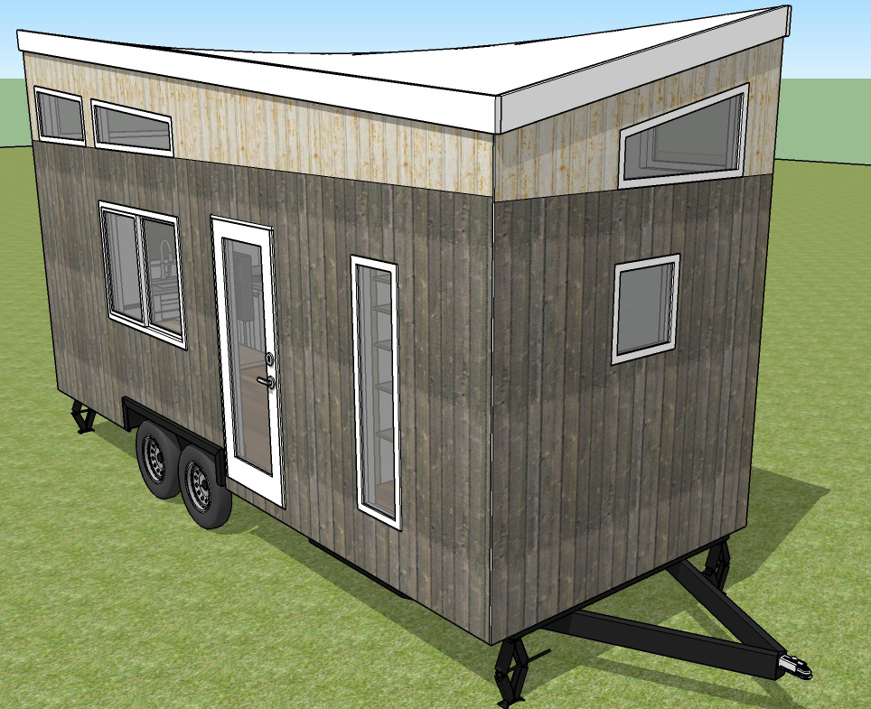
Aside from a seldom used trailer length, the other aspect that makes this design a paradox is the roof line. At first glance looking at any of the corners, you see a shed roof in two directions, so you might think that this is simply a shed roof tilted in two axes, aka a compound shed roof. But then you walk around to the opposite corner, only to have the same exact shape come into focus, at which point you start to scratch your head and hone in on how this is possible. After taking a step inside and scoping the lines from here, you then understand that it is a warped roof. It’s an elegant play on geometry, using walls that are linear in nature, but creating a ceiling surface that has a spherical aspect to it. It really does force your brain to study what is going on, but once it clicks you are free to enjoy the other aspects of the design.
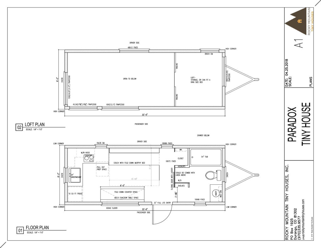
The interior layout has an emphasis on three main goals: open concept floor plan, a sleeping solution on the main floor, and a full size tub. I was able to meet all three by pulling out some classic tiny house design tricks. You enter through a 32″ door on the passenger side, directly in front of the wheel well. Right takes you into the bathroom, straight into the living area, and left to the kitchen. A centrally located entry means no tight hallways to navigate through, and easy access to any part of the house.
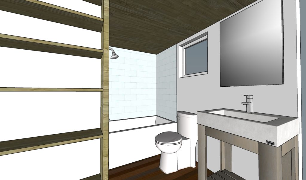
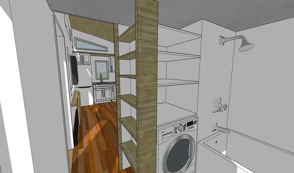
In the bathroom, I had to cheat a little and go with a compact (54″) rather than full size tub, but it will still soak those tired bones just fine. Not only is there ample room for a flush toilet, small window, and large vanity along the front wall , but opposite these features is a washer dryer combo with massive storage shelving above. As you head back towards the living space, narrow shelves extend floor to ceiling for shoe storage or whatever else you can fit in. If you don’t like the look of open shelves, put some cabinet doors on and call it good! The bathroom can be closed off for privacy with a sliding barn door. On the other side of the shower valve wall is a closet facing the living side.
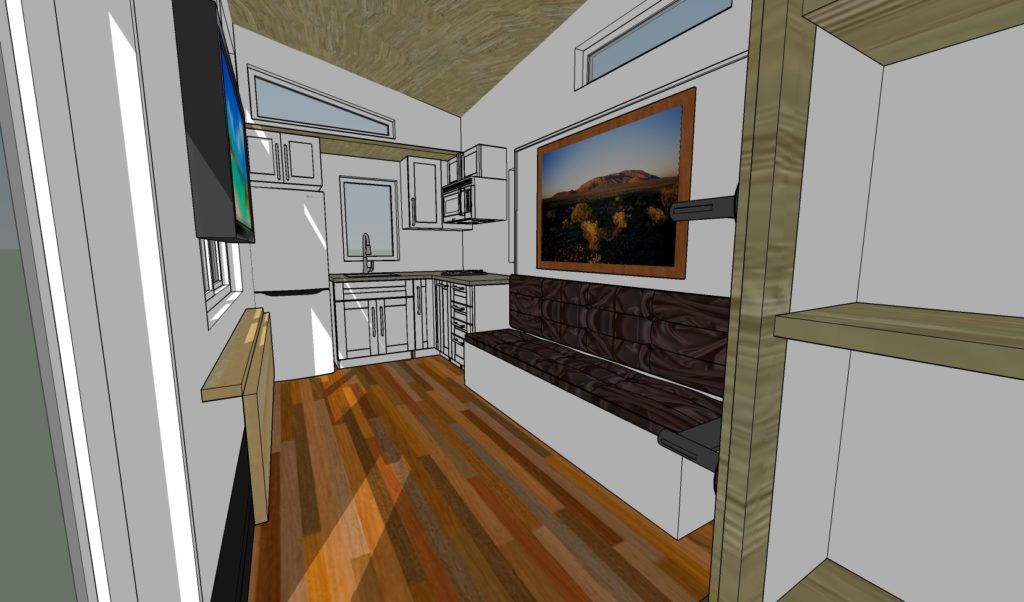
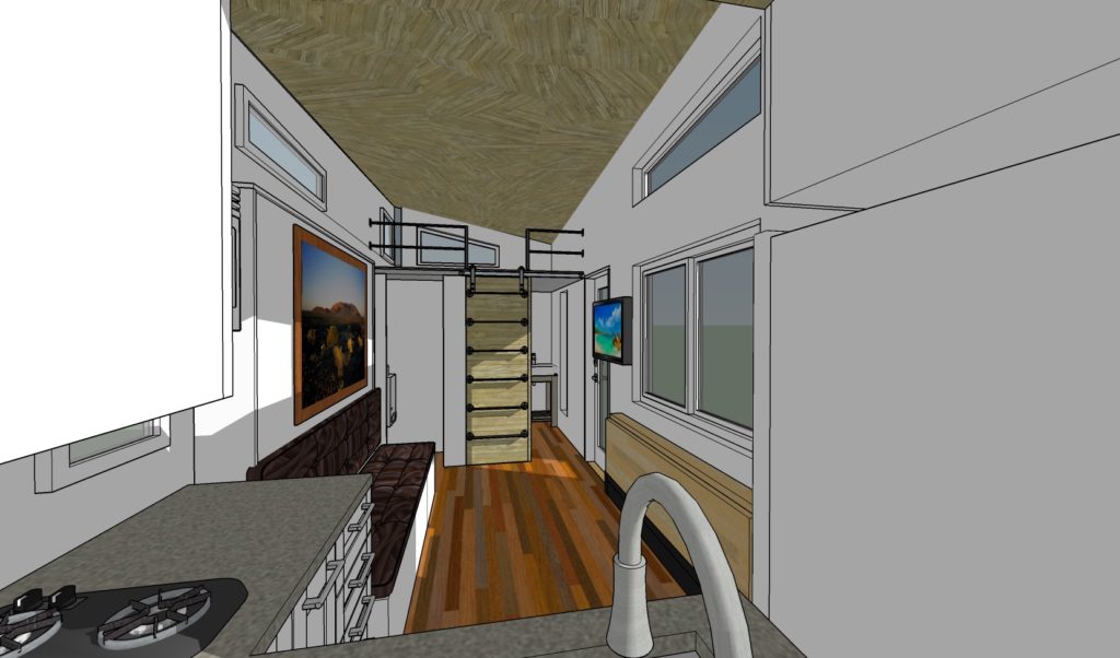
The living room is left as open as possible with a built in couch with pull out drawers over the driver side wheel well. There is room to mount a TV opposite the couch, next to the entry door. Immediately adjacent the couch begins the kitchen, utilizing an L-shape layout. From left to right, a 10 cubic foot Fridge with cabinet above, then the sink, then a corner cabinet, rounding the corner a two burner cooktop with a combo microwave/convection oven/range hood above, a pull out pantry below, then some cabinet prep space. Not a huge or fancy kitchen, but certainly adequate. There is no interference with the wheel wells, so unmodified stock cabinets will work well here.
Coming back into the living space, opposite the couch, there is a 22″deep x 72″ long fold down table that can be used for dining, laptop, games, arts and crafts, you name it. Fold it back down when you are done, and the entire living room floor is open for yoga, exercise, stretching, building sheet forts, or whatever tickles your fancy. At this point, you have yet to see the downstairs sleeping option. This takes the form of a Murphy bed that is blended into the couch design-Couch during the day, and the bed folds down at night and sits on top of the couch. No climbing stairs or ladder, no claustrophobic feeling of a cramped loft, no banging your head on the ceiling, just a simple tilt of the bed down, and you are ready for a good nights rest!
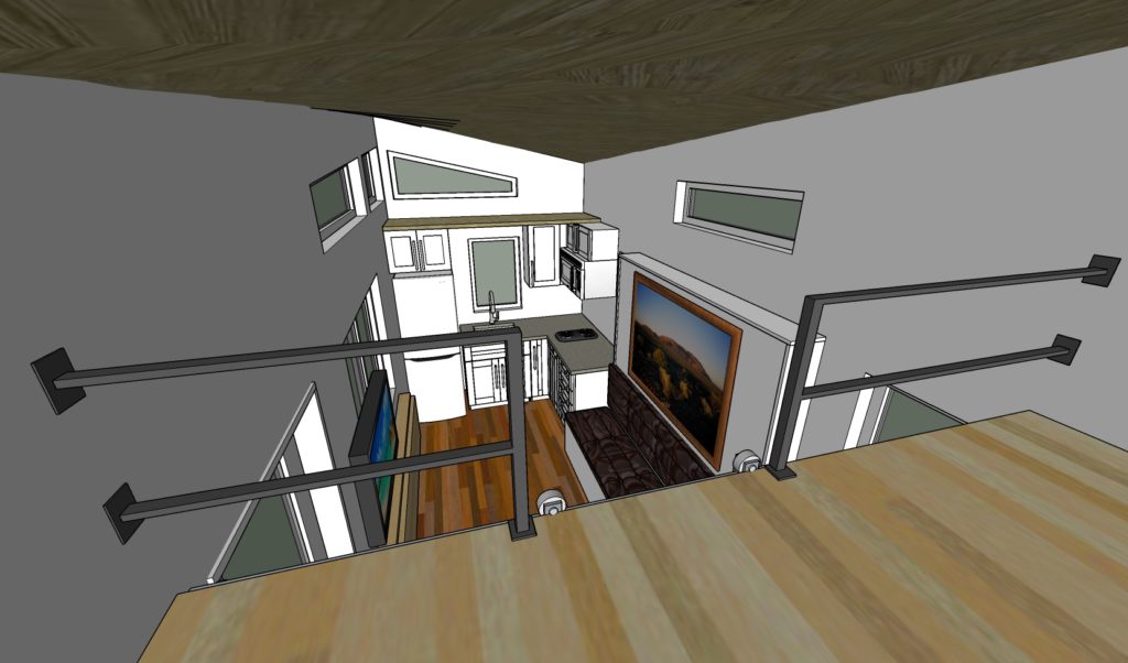
The last notable feature of this design is that there is still a loft included. It actually is tall enough to use for sleeping quarters, if you or a guest so desires, but in our mind it would function more as a storage or extra hangout space. It is accessed via a ladder mounted to the bathroom barn door.
Here is a brief animation showing the overall massing and interior layout.
